
"Education is not the filling of a pail but the lighting of a fire." - William Butler Yeats
Personal Branding
-
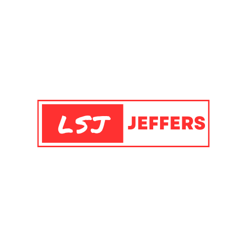
Logo design
An Emblem of Identity
In crafting my logo, the essence of my professional identity converges into a simple yet impactful design. The dominant red hue signifies passion and dynamism, mirroring my fervor for creating vibrant and unforgettable events.
The design centers around my initials and last name, encased within a sleek box. The initials, strategically highlighted, symbolize the focal point of my identity—my name. This deliberate choice communicates a sense of individuality and personal branding. The box, in its clean lines, adds a touch of sophistication and organization, reflecting my commitment to precision and structure in event management.
By integrating color psychology, design aesthetics, and personal branding principles, the logo becomes more than a visual identifier—it becomes a symbol of my professional journey, values, and the exciting events I bring to life.
-
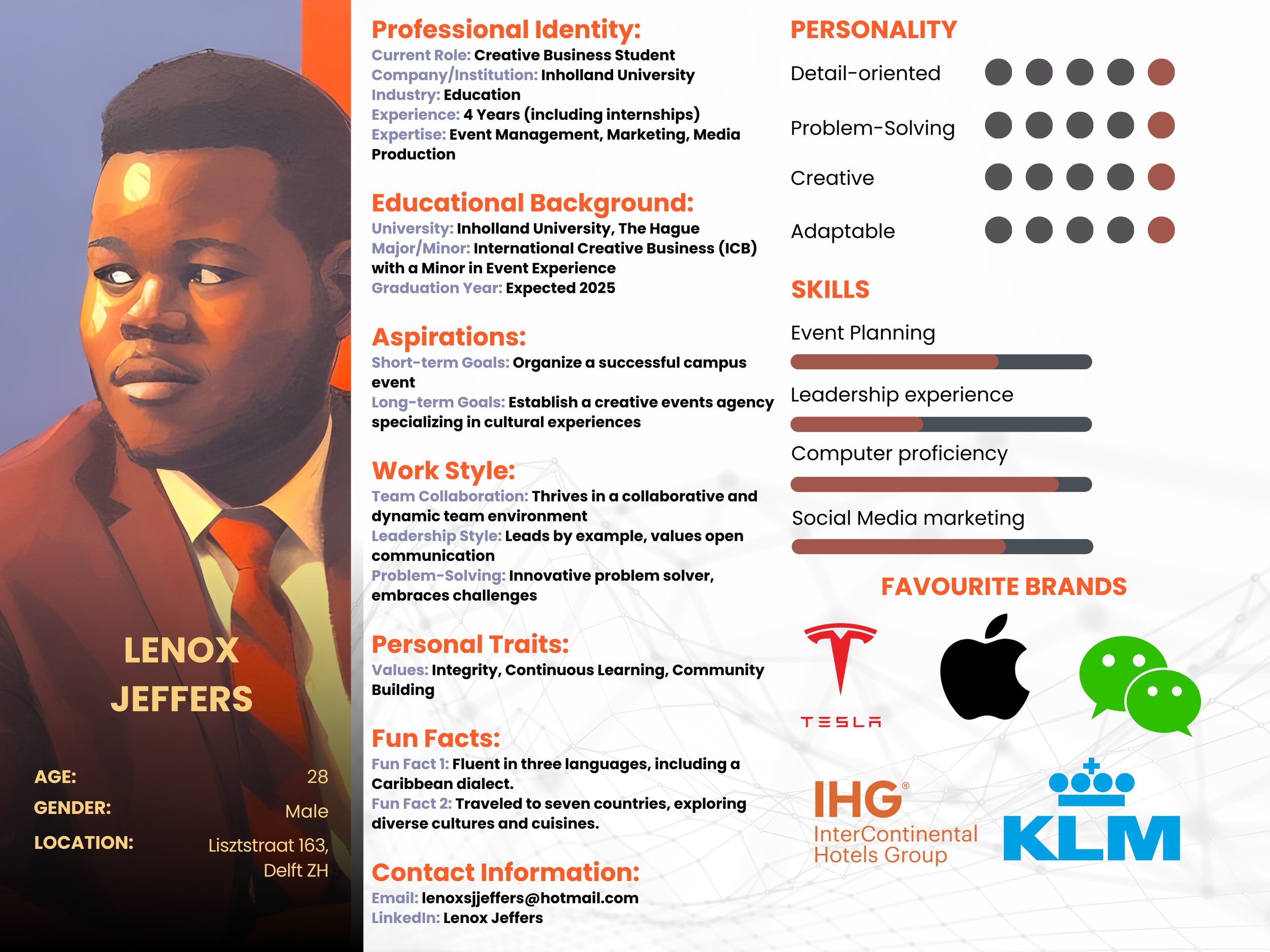
Persona Infografic
Unveiling the Mosaic of My Identity
Embark on a visual journey through the facets that shape my identity and professional persona. This infographic serves as a kaleidoscopic snapshot, blending various elements to paint a comprehensive picture of who I am.
As you absorb the vibrant hues and intricate details of this infographic, you'll gain a deeper understanding of the mosaic that defines me—a professional, a creator, and an individual with a palette of diverse experiences and influences.
A Visual Symphony of Identity
-
In crafting my personal branding, the color red takes center stage, embodying passion, energy, and determination. These qualities resonate with my dynamic approach to marketing and event management. The vibrancy of red communicates my enthusiasm for creating engaging and memorable experiences (Chapman, 2018).
-
Augmenting the main red palette are shades of orange, green, and yellow, symbolizing sustainability. Orange evokes creativity, green reflects environmental consciousness, and yellow signifies positivity. Together, they convey my commitment to organizing events that not only captivate but also prioritize sustainable practices.
-
Black, strategically employed for highlights, introduces a sense of structure and sophistication. It represents the backbone of my organizational skills and attention to detail in executing events. The contrast with vibrant colors reinforces the balance between creativity and precision.
-
Drawing inspiration from website layouts, my design adopts a structured, reader-friendly format. This aligns with contemporary digital trends, ensuring that information is presented clearly and accessibly. The design mirrors the user-centric approach, emphasizing seamless interaction with my brand (Marc-Oliver, 2021).
-
Infused with insights from past journalism courses, my tone of speech and text embodies clarity, conciseness, and engaging storytelling. This journalistic touch adds depth to my brand communication, narrating compelling stories around events and marketing initiatives (Nieman Reports, 2020).
-
My personal branding transcends visual elements, encompassing a holistic approach. From color psychology to design inspiration and linguistic nuances, each detail is a strategic choice. This comprehensive branding ensures that my identity is not just memorable but also aligns cohesively with my values and professional ethos.
-
my personal branding is an intentional fusion of color symbolism, design principles, and communication strategies. It is not just a visual representation but a narrative that speaks to my professional identity—a dynamic marketer and event organizer with a commitment to sustainability, precision, and engaging storytelling.